
David Flores: The Artist Who Makes Icons Worth Another Look
Through bold contours and stained-glass color, David Flores transforms familiar faces into images that demand a second and much closer look.
I have followed David Flores for so long that it took me a while to remember how I first discovered him.
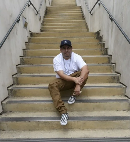
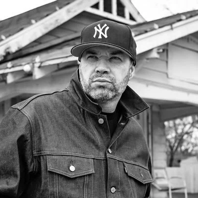
Then the light bulb went off: Danny Boy O’Connor.
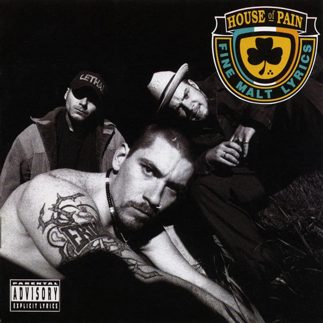
Danny Boy is a founding member of House of Pain, the group behind the inescapable “Jump Around,” and La Coka Nostra. He is also the founder of The Outsiders House Museum in Tulsa, Oklahoma, where he helped save and restore the house used as the Curtis brothers’ home in Francis Ford Coppola’s film.
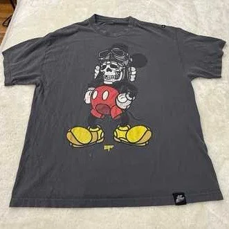
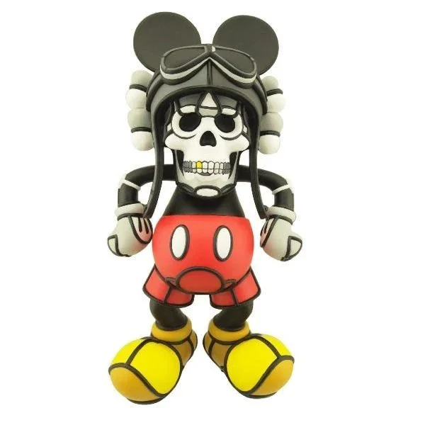
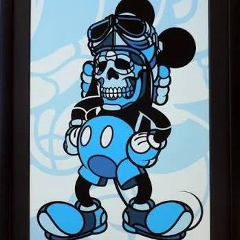
One of Danny Boy’s other interests was the motorcycle-inspired Hellfire Canyon Club. I liked the brand’s original T-shirt, which eventually led me to Flores’s Deathshead Mickey graphics and vinyl figure.
My immediate reaction was: That is bold.
Flores had taken one of the most beloved and protected symbols in American popular culture and transformed it into something rebellious, sinister and slightly dangerous. The design did not simply borrow Mickey Mouse. It challenged everything Mickey was supposed to represent.
I think I connected with it because it reminded me of the Wacky Packages cards and stickers I collected as a child. Wacky Packages, often called Wacky Packs, parodied familiar consumer brands by turning their packaging and mascots into something strange, gross or subversive.
Some boys collected baseball cards.
I collected Wacky Packages.
Deathshead Mickey touched that same nerve. It took something safe and recognizable and made it feel forbidden.
That figure led me into the larger world of David Flores. What began with a rebellious cartoon mouse became an almost two-decade fascination with the artist’s ability to reconstruct cultural icons one bold, black line at a time.

Who Is David Flores?
David P. Flores is an American contemporary artist, muralist and designer from Tulare, California. According to his official biography, his mother introduced him to oil painting when he was seven. He later studied graphic design in Santa Barbara and began his professional career in the skateboarding industry.
He was published internationally while still a teenager and created graphics for companies including Shorty’s, Powell Peralta, Anti Hero, Real and Spitfire Wheels. That background matters. Skateboarding taught Flores how to make an image communicate instantly whether it appeared on a deck, wheel, sticker or T-shirt moving through the street.
Around 2000, he began developing the segmented visual language he calls his “Stained Glass” style. He applied it to portraits of artists, musicians, actors, explorers and other cultural figures, as well as familiar animated characters.
The work eventually expanded from prints and skate graphics into paintings, designer toys, brand collaborations and enormous public murals. His 2006 Bad Dunny is even represented in The Museum of Modern Art’s collection.
Flores moves easily between urban culture and major institutions because he does not appear to recognize a meaningful boundary between them. A skateboard deck, vinyl figure, gallery wall and public building are simply different surfaces waiting for an image.
What Makes the Work Recognizable?
You do not need to see David Flores’s signature to recognize his work.
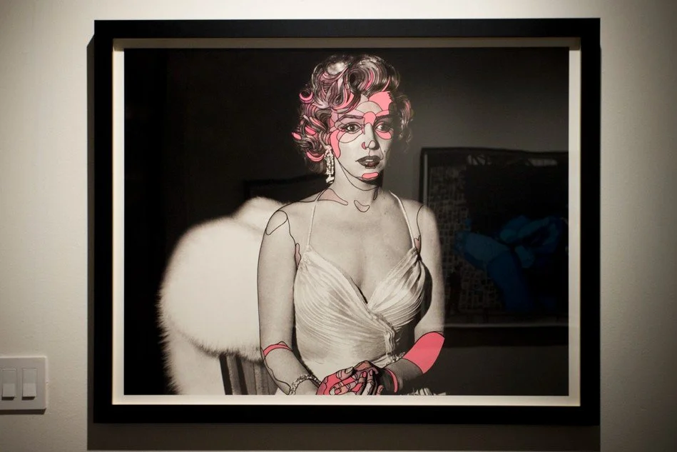
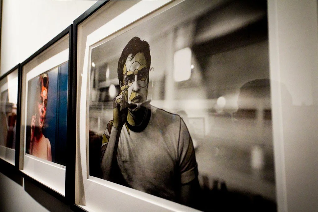
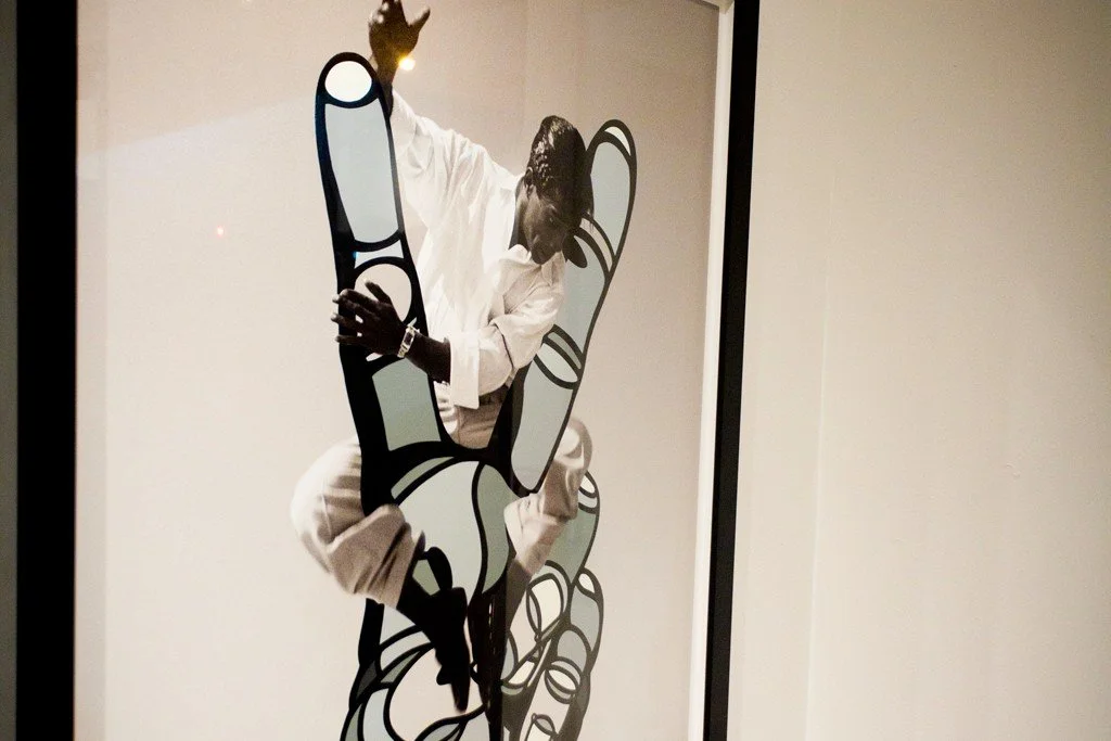
His style begins with thick black lines that divide a face or figure into irregular sections. Those sections are then filled with different colors, tones and gradients, producing an effect that resembles stained glass, a mosaic or even a topographic map.
Imagine mapping the elevations of a person’s face. The forehead, cheekbones, nose, lips and jaw become separate territories. Flores outlines those territories in black and then fills them almost like an elaborate color-by-numbers drawing.
From a distance, the subject is immediately recognizable.
Up close, the face begins to fragment.
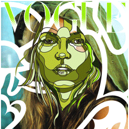
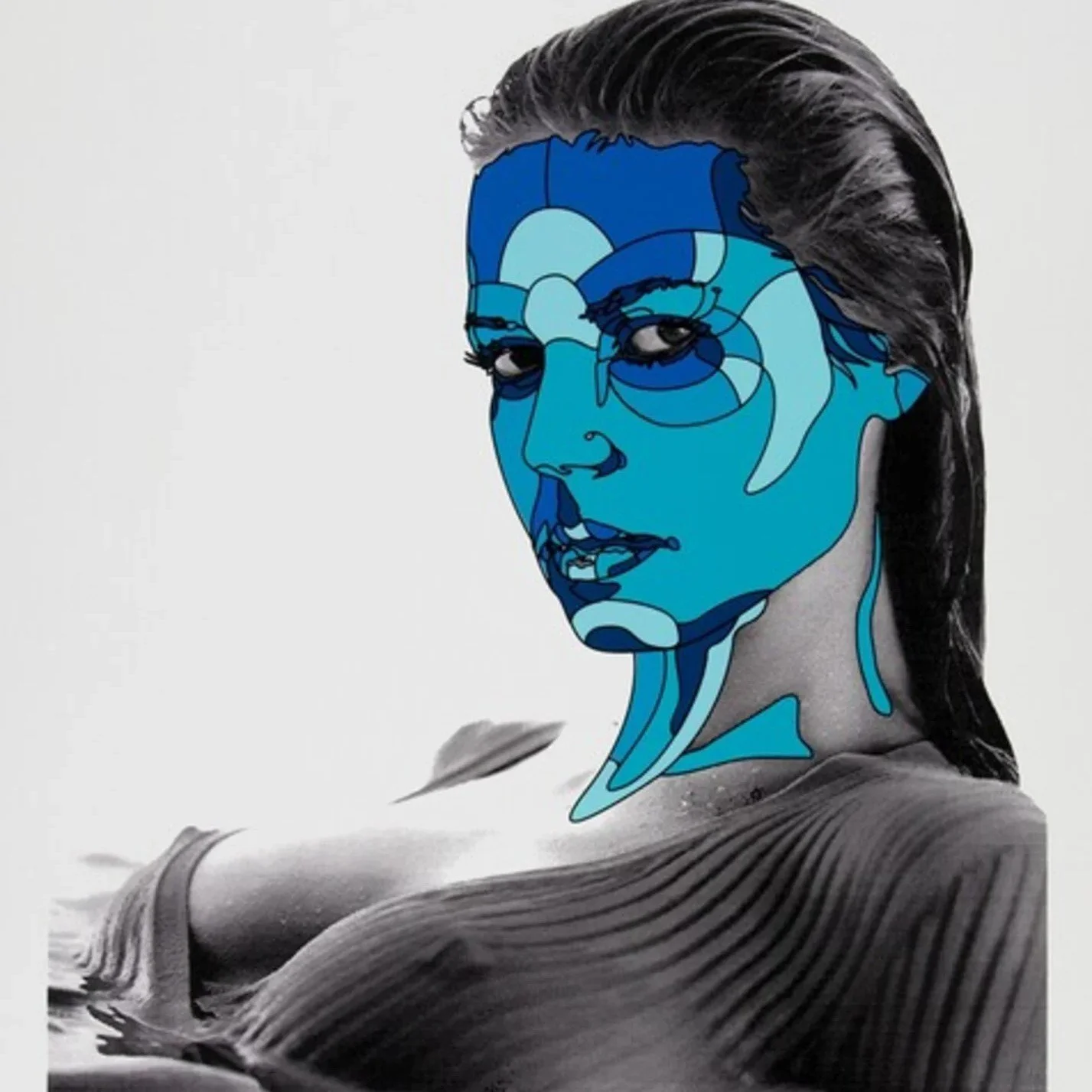
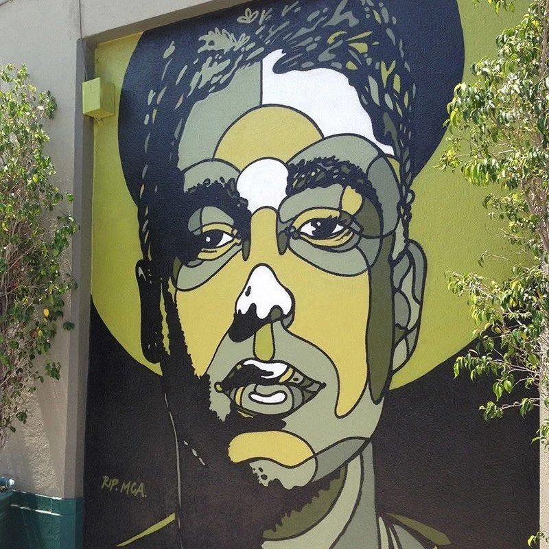
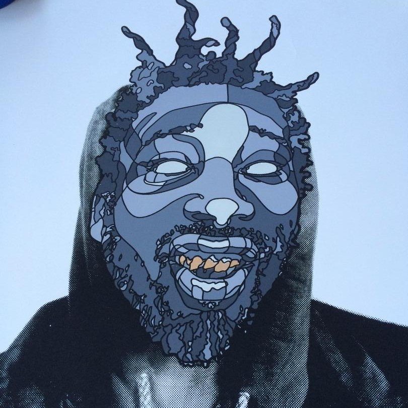
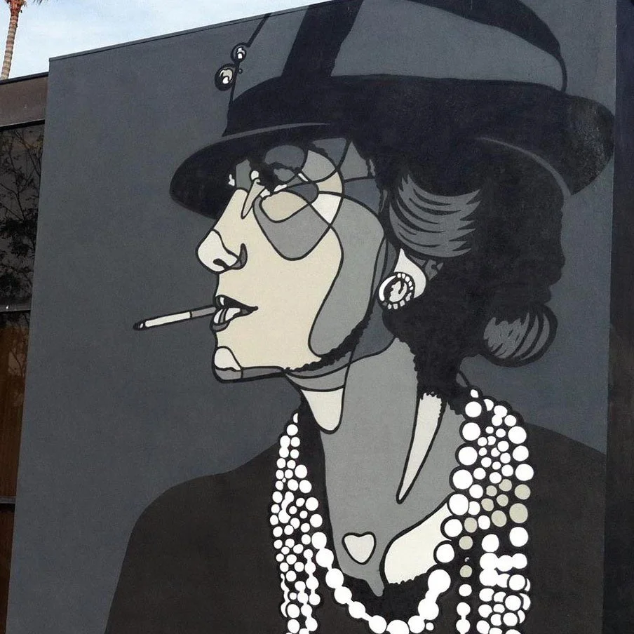
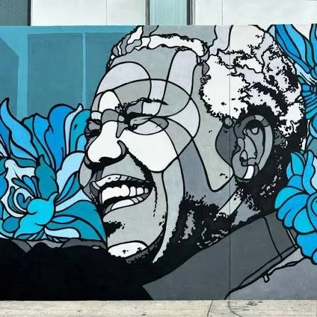
That tension is what makes the work so compelling. Flores preserves enough of the original person for us to recognize the icon, but he disrupts the image enough to make us study it again.
His work is also remarkably independent of typography. He generally does not need words, slogans or explanations. The subject, composition and line work carry the message. When lettering does appear, as in collaborations with legendary Los Angeles graffiti artist Chaz Bojorquez, it becomes a deliberate meeting of two visual languages.
The style translates beautifully across scale. It works on a small print or vinyl toy, but Flores may be best experienced through his monumental murals. When those black contours stretch across a building, the city itself begins to resemble one of his segmented portraits.
What Is Happening Beneath the Surface?
At first glance, Flores appears to make portraits of famous people.
Look longer, and something more complicated is happening.
His subjects have included Pablo Picasso, Mother Teresa, Neil Armstrong, Coco Chanel, Jean-Michel Basquiat, Bob Marley, Adam “MCA” Yauch, Mos Def and many others. He also works with figures drawn from animation and popular entertainment.
The choice of subject is rarely neutral.
By enlarging and reconstructing these familiar faces, Flores elevates and immortalizes them. He asks us to do more than recognize the person. He asks us to look at them.
Really look.
Photography can capture a face with extraordinary accuracy, but familiarity sometimes allows us to pass over the image too quickly. Flores slows that process down. His geometric divisions make the viewer examine the eyes, contours, shadows and expressions separately before assembling them again.
The icon becomes human.
The people he depicts may have made extraordinary cultural contributions, but they also carried contradictions, imperfections, joys and sorrows. Flores’s portraits seem to hold both ideas simultaneously: the public figure we think we know and the private person we never completely can.
Even his cartoon characters gain a different emotional charge. Deathshead Mickey becomes rebellion. Snoopy becomes attitude. Familiarity is not the final destination; it is Flores’s point of entry.
Three Projects That Show His Range
Phil Stern: Reworking Hollywood Memory
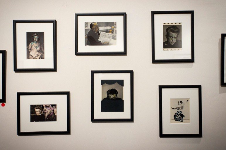
In 2011, Flores collaborated with legendary photographer Phil Stern, whose images documented some of the defining personalities of twentieth-century entertainment.
Flores applied his graphic treatment directly to Stern’s photographs of figures including Marilyn Monroe, Louis Armstrong, Sammy Davis Jr., James Dean and Frank Sinatra. The resulting exhibition brought two artistic generations together: Stern’s documentary eye and Flores’s contemporary visual reconstruction.
The collaboration did not bury the original photography. It made viewers encounter those images again. Flores brought the present into conversation with the past without erasing either one.
Stern reportedly described the treatment as “Warholesque.” That feels right. Flores was not reproducing celebrity; he was examining how celebrity imagery becomes part of our shared visual memory.
World Stage Legacy: The Coliseum as Canvas
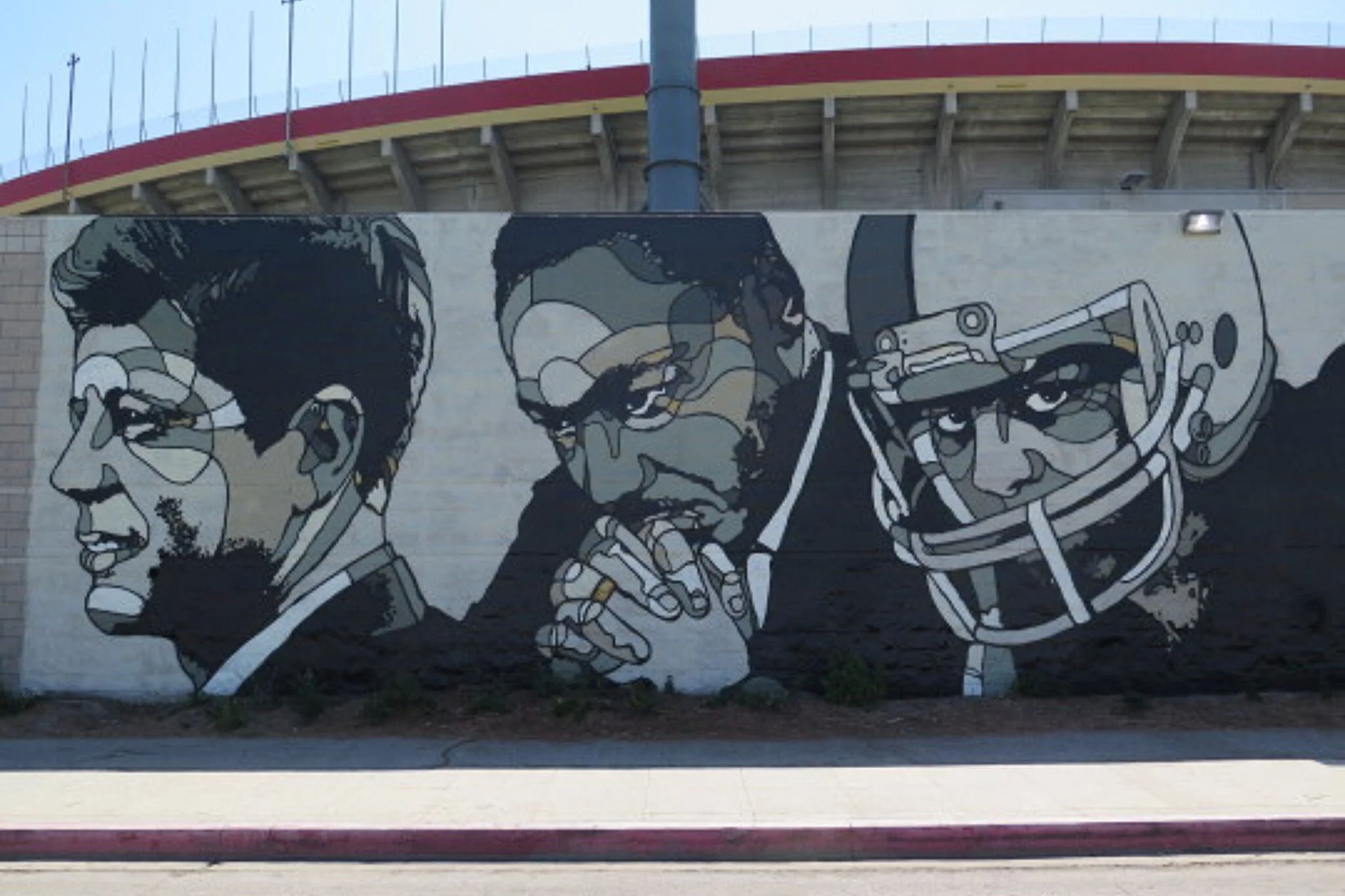
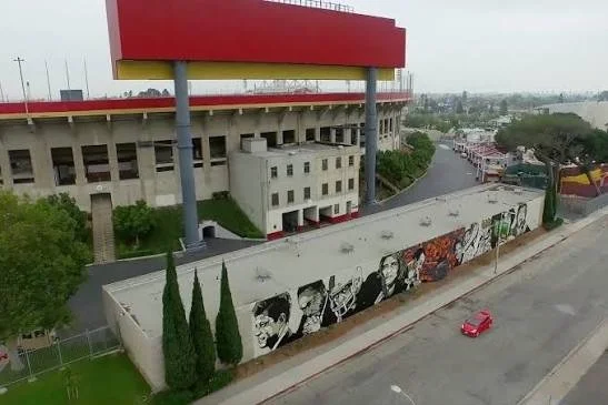
Flores’s 2015 World Stage Legacy mural wraps around the exterior of the Los Angeles Memorial Coliseum.
The Mural Conservancy of Los Angeles lists the work at 20 feet high and 220 feet long. At that scale, Flores’s segmented style becomes almost architectural. The wall no longer supports the artwork. The wall becomes the artwork.
The project illustrates why his visual language is so effective in public spaces. His images can be understood quickly by someone driving past, yet they reward pedestrians willing to stop and inspect the details.
It is graphic design operating at the scale of civic memory.
Winning Time: Art That Gives Something Back
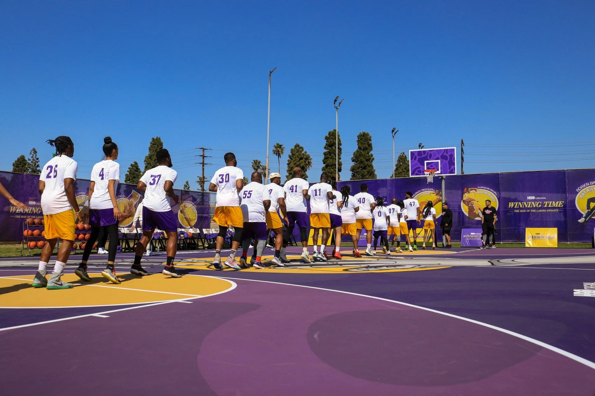
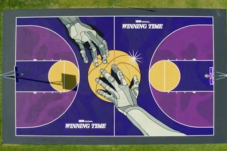
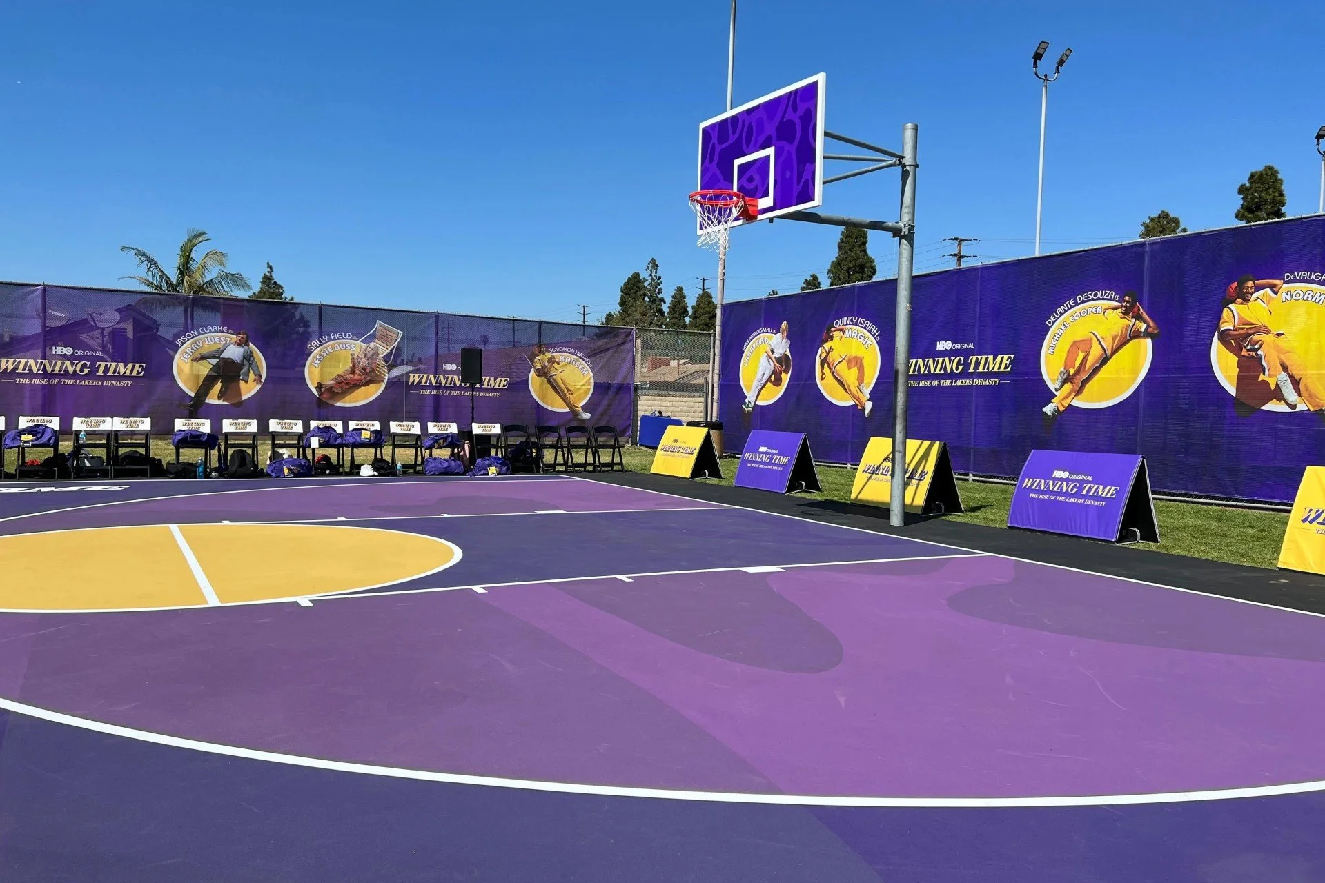
For the 2022 premiere of HBO’s Winning Time: The Rise of the Lakers Dynasty, Flores worked with Project Backboard to redesign the basketball court at Rogers Park in Inglewood.
The court used the purple, gold and white associated with the Showtime-era Lakers, filtering that history through Flores’s stained-glass geometry. More importantly, the project left the community with a renewed public space after the promotional moment had passed.
Instead of creating another temporary billboard, HBO, Project Backboard and Flores created something people could use.
That distinction matters. The best brand-and-artist collaborations do not simply borrow credibility from culture. They contribute something to it.

What Initially Drew Me In?
Deathshead Mickey opened the door, but Flores’s portraits kept me inside.
As I explored his work, I encountered the 2009 Heidi Klum print. The subject naturally caught my attention, but the treatment made me want to understand the artist behind it. I then found his portraits of musicians, actors, artists and historic figures—each reconstructed through the same unmistakable visual system.
More than fifteen years later, the effect still intrigues me.
Flores has created something increasingly rare: a style that is both immediately accessible and entirely his own. You do not need an art-history education to enter the work. Recognition provides the invitation. The formal technique and emotional interpretation give you reasons to remain.
That accessibility does not make the art shallow. It makes the first step easier.
The Piece I Would Keep
The honest answer is that I already live with several David Flores pieces.
An artist proof of his Basquiat hangs in my office. Basquiat remains one of the most important figures in the evolution of urban art, and Flores’s treatment feels less like imitation than one artist acknowledging another.
Also in my office is Frank, Flores’s 2016 collaboration with Chaz Bojorquez. Flores supplies the portrait of Frank Sinatra; Bojorquez brings the lettering and unmistakable visual heritage of Los Angeles graffiti.
The piece makes me think of my parents, who were enormous Sinatra fans. That gives it a meaning beyond either artist, the subject or its value as a collectible. It connects their musical world to my visual one.
At home, I have pieces from Peanuts Attitude, Flores’s officially licensed collaboration with Dark Hall Mansion and Peanuts Worldwide. The collection brings his stained-glass treatment to Snoopy, Charlie Brown and other characters without sacrificing the personality that made them beloved.
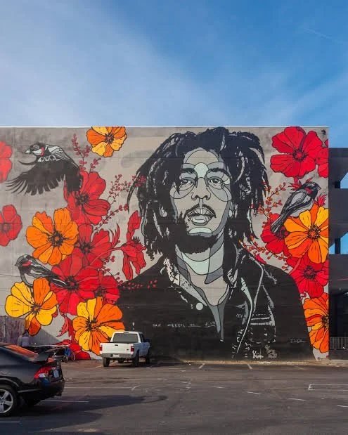
But the Flores piece I still wish I owned is Three Little Birds, his tribute to Bob Marley.
The subject alone brings the Walls and Wax worlds together. Yet it is the surrounding birds and flowers that complete the composition. They turn the familiar portrait into something more expansive— a tribute not only to Marley’s likeness, but also to the peace, reassurance and enduring optimism associated with his music.
It is the kind of image I would never tire of seeing.
Why David Flores Matters
David Flores sits at an unusual intersection: skateboarding, street art, fine art, music, designer toys, sports, entertainment and commercial design.
Many artists enter those worlds temporarily. Flores has built a visual language strong enough to remain recognizable in all of them.
He also understands something fundamental about popular culture: familiarity can create emotional connection, but it can also make us stop paying attention. His work interrupts that familiarity.
Flores does not merely show us icons.
He makes us reconsider why they became icons and what they still mean to us.
That is why his best work feels both monumental and personal. Whether it occupies a 220-foot wall or a framed print in my office, it asks for the same thing:
Don’t just see the subject.
Look closer.
Look Closer
Explore more of David Flores’s work through his official website, follow @davidfloresart on Instagram or view his work in MoMA’s collection.
Collector’s question: Which David Flores subject would you most want to live with—one of his cultural icons, a subverted cartoon character or a mural-scale public work—and why?